
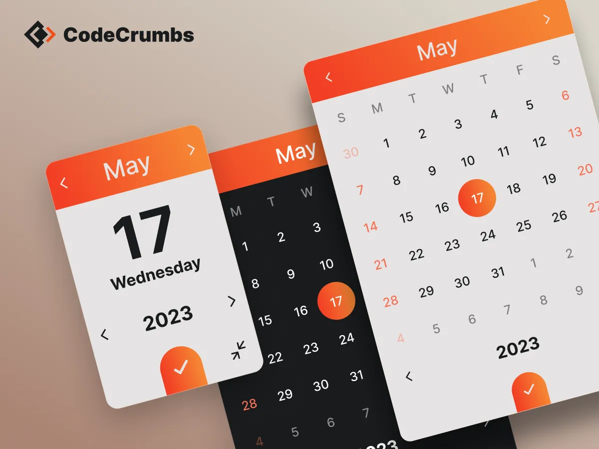
Date Picker

</ head>
</ body>
<!-- CODECRUMBS DATE PICKER -->
<script src="https://cdn.jsdelivr.net/gh/CodeCrumbsApp/date-picker@latest/index.min.js"></script>
<script>
  window.CodeCrumbs.DatePicker({
    dateFieldSelector: '.date-field-class',
    format: 'M S y',
  })
</script>
HTML/Embed
<!-- CODECRUMBS DATE PICKER -->
<script src="https://cdn.jsdelivr.net/gh/CodeCrumbsApp/date-picker@latest/index.min.js"></script>
<script>
  window.CodeCrumbs.DatePicker({
    dateFieldSelector: '.date-field-class',
    format: 'M S y',
  })
</script>
<!-- CodeCrumbs -->
<script>
!function(e,t){e[t]=new Proxy(e[t]||{},{get:(e,o)=>new Proxy(e[o]||function(){},{apply:(n,r,a)=>{const c=()=>e[o](...a);"complete"===document.readyState?c():document.addEventListener("readystatechange",(n=>{"complete"===n.target.readyState&&(e?.[o]?c():console.error(`${t}.${o} is not a function. Did it load correctly from the CDN? If not, did you use the correct name.`))}))}})})}(globalThis,"CodeCrumbs");
</script>
How to use:
Unlock more with PRO
Want to learn how to use this Crumb? Unlock detailed documentation, video tutorials, comments & support!
Unlock more with PRO
Want to learn how to use this Crumb? Unlock detailed documentation, video tutorials, comments & support!
Date Picker Options:
| Option | Type | Default | Descrption |
|---|---|---|---|
dateFieldSelector |
string | -- | class, id, or html tag |
language |
string | 'en' |
Read Documentation |
isExpandable |
boolean | true |
open/close full size picker |
onlyShowAsExpanded |
boolean | true |
full size picker only |
format |
string | 'd-m-y' |
Read Documentation |
doubleView |
boolean | false |
show two months at a time |
disabledWeekDays |
string | -- | Read Documentation |
disabledDays |
string | -- | Read Documentation |
minDate |
string | -- | Read Documentation |
maxDate |
string | -- | Read Documentation |
minYear |
string | -- | Read Documentation |
maxYear |
string | -- | Read Documentation |
startWeekOnMonday |
boolean | false |
instead of Sunday |
dateRange |
boolean | false |
Read Documentation |
minRange |
number | -- | Read Documentation |
maxRange |
number | -- | Read Documentation |
setDateForThisSelector |
string | -- | Read Documentation |
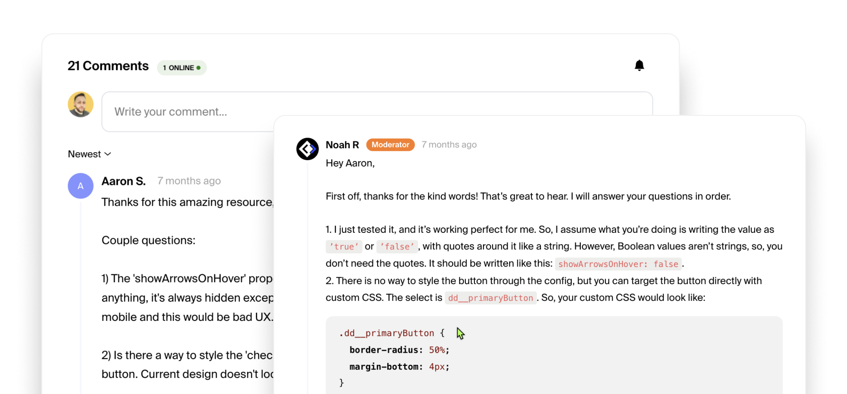
showArrowsOnHover |
boolean | true |
instead of always |
overlay |
boolean | false |
Show bg overlay when open |
onChange |
callback () | -- | Read Documentation |
onRangeSet |
callback () | -- | Read Documentation |
onDatePickerOpen |
callback () | -- | Read Documentation |
onDatePickerExit |
callback () | -- | Read Documentation |
styles |
{ object } | -- | Read Documentation |
Language Documentation:
Below is a list of languages. Copy the script for language you wish to use and place it underneath the Date Picker script (above the Date Picker function). Next, copy the abbreviated "value" from the second column and use that as the value for the language option in the Date Picker function.
<!-- CODECRUMBS DATE PICKER -->
<script src="https://cdn.jsdelivr.net/gh/CodeCrumbsApp/date-picker@0.1.4/index.min.js"></script>
<script src="https://cdn.jsdelivr.net/gh/CodeCrumbsApp/date-picker@0.1.4/lang/datepicker-language-ES.min.js"></script>
<script>
window.CodeCrumbs.DatePicker({
  dateFieldSelector: '.date-field-class',
  format: 'M S y',
  language: 'es'
})
</script>
| Language | Value | Script |
|---|---|---|
| Arabic | 'ar' |
|
| Danish | 'da' |
|
| German | 'de' |
|
| Spanish | 'es' |
|
| French | 'fr' |
|
| Greek | 'gr' |
|
| Hungarian | 'hu' |
|
| Italian | 'it' |
|
| Korean | 'ko' |
|
| Dutch | 'nl' |
|
| Polish | 'pl' |
|
| Portuguese | 'pt' |
|
| Russian | 'ru' |
|
| Slovenian | 'si' |
|
| Turkish | 'tr' |
|
| Ukrainian | 'uk' |
|
format Documentation:
Below you will see values for various formatting options. The value is a string which means we can combine them any way we'd like. You can use /, - or , as an example in between the format values to display the date however you'd like.
Example: "WW the S" would display as "Monday the 5th." Play around with it!
| Value | Description |
|---|---|
'y' |
four digit year value, e.g. 2019 |
'MM' |
full name of the month, e.g. January |
'M' |
short name of the month, e.g. Jan |
'WW' |
full name of the weekday, e.g. Monday |
'W' |
short name of the weekday, e.g. Mon |
'w' |
weekday number, as per getDay() javascript function, e.g. 1 |
'mm' |
month in numbers with leading zero, e.g. 01 |
'm' |
month in numbers without leading zero, e.g. 1 |
'dd' |
weekday in numbers with leading zero, e.g. 01 |
'd' |
weekday in numbers without leading zero, e.g. 1 |
'S' |
weekday in numbers with a suffix ending, e.g. 1st |
disabledWeekDays Documentation:
If you'd like certain days of the week to not be selectable, then you can use the disabledWeekDays option. This option takes a 'string' as a value with the options listen below. You can combine these values in a string by using a comma to separate the values. For example: '0, 6' would disable Saturdays and Sundays from being selected.
| Day | Value |
|---|---|
| Sunday | '0' |
| Monday | '1' |
| Tuesday | '2' |
| Wednesday | '3' |
| Thursday | '4' |
| Friday | '5' |
| Saturday | '6' |
disabledDays Documentation:
If you'd like specific days to not be selectable, then you can use the disabledDays option. This option takes a 'string' of dates as a value. You can combine these date values in a string by using a comma to separate the values. For example: '2019/12/30, 2019/12/31'.
minDate and maxDate Documentation:
Use the minDate and the maxDate options if you want to make the dates selectable from or until the defined date. Dates must be provided in the standard format yyyy/mm/dd (e.g. '2019/03/28').
<!-- CODECRUMBS DATE PICKER -->
<script src="https://cdn.jsdelivr.net/gh/CodeCrumbsApp/date-picker@0.1.4/index.min.js"></script>
<script>
window.CodeCrumbs.DatePicker({
  dateFieldSelector: '.date-field-class',
  format: 'M S y',
  minDate: '2019/01/01',
  maxDate: '2024/01/01',
})
</script>
| Option | Type |
|---|---|
minDate |
string |
maxDate |
string |
minYear and maxYear Documentation:
Use the minYear and the maxYear options to set the maximum and minimum selectable year. The selected year must be provided in the format yyyy (e.g. '2019').
<!-- CODECRUMBS DATE PICKER -->
<script src="https://cdn.jsdelivr.net/gh/CodeCrumbsApp/date-picker@0.1.4/index.min.js"></script>
<script>
window.CodeCrumbs.DatePicker({
  dateFieldSelector: '.date-field-class',
  format: 'M S y',
  minYear: '2019',
  maxYear: '2024',
})
</script>
| Option | Type | Default |
|---|---|---|
minYear |
number | currentYear - 50 |
maxYear |
number | currentYear + 50 |
dateRange Documentation:
The range option can be set up on one or two elements. When enabled, this option allows the user to select a start and an end date from the same date picker. In case of two inputs, it will automatically fill the start date on the first input and the end date on the last.
| Option | Type | Default |
|---|---|---|
dateRange |
boolean | false |
minRange and maxRange Documentation:
If set, these limit the range selection based on the value given when user starts selecting a range date. The value indicates the number of days selectable. Of course, it works only when the range option has been set as true.
| Option | Type |
|---|---|
minRange |
number |
maxRange |
number |
setDateForThisSelector Documentation:
You can use setDateForThisSelector to set the selected date value as another input fields value. This might be useful if you want to trigger the Date Picker with a button instead of an input field for example. Then you can set a hidden input fields value with the date that has been selected. This option takes a string with the value being a class, id, attribute or html tag.
| Option | Type |
|---|---|
setDateForThisSelector |
string |
Event Callback Documentation:
We have 4 events we can listen for, which are the parameters listed below. They each take a callback function as their value. You can use the res argument to access the selected date output.
In the example below, you can see we are using the date output to show the user a message with the date that they have selected. You will also notice that we are using the format we want after res.output to display the date how we'd like.
<!-- CODECRUMBS DATE PICKER -->
<script src="https://cdn.jsdelivr.net/gh/CodeCrumbsApp/date-picker@0.1.4/index.min.js"></script>
<script>
window.CodeCrumbs.DatePicker({
  dateFieldSelector: '.date-field-class',
  format: 'M S y',
  onChange: (res) => {
  	console.log(`You have selected ${res.output.mm} / ${res.output.dd} / ${res.output.y}`);
  }
})
</script>
| Option | Type | arguments |
|---|---|---|
onChange |
callback () | res |
onRangeSet |
callback () | res |
onDatePickerOpen |
callback () | res |
onDatePickerExit |
callback () | res |
styles Documentation:
The styles option takes an object as its value. Inside that object we have several style options we can use as shown in the table below, and you can choose to use only the ones you want. The style options take a 'string' as a value. That string can be any CSS value. For example, you can see that the default accentBackgroundColor is a gradient.
<!-- CODECRUMBS DATE PICKER -->
<script src="https://cdn.jsdelivr.net/gh/CodeCrumbsApp/date-picker@0.1.4/index.min.js"></script>
<script>
window.CodeCrumbs.DatePicker({
  dateFieldSelector: '.date-field-class',
  format: 'M S y',
  styles: {
  	backgroundColor: '#FFFFFF',
		backgroundOverlay: 'rgba(0, 0, 0, .2)',
		primaryTextColor: '#333333',
		secondaryTextColor: '#FFFFFF',
		tertiaryTextColor: '#FD4741',
		accentBackgroundColor: 'linear-gradient(45deg, #e61e68 0%, #FD4741 100%)',
		borderRadius: '.35em',
		dropShadow: '0 0 2.5em rgba(0, 0, 0, 0.1)',
		dateRangeBackgroundColor: 'rgba(0, 0, 0, 0.05)',
  }
})
</script>
| Option | Type | default | description |
|---|---|---|---|
backgroundColor |
string | '#ffffff' |
general background color |
backgroundOverlay |
string | 'rgba(0, 0, 0, .2)' |
bacground overlay color |
primaryTextColor |
string | '#333333' |
main text color on background |
secondaryTextColor |
string | '#ffffff' |
text color on top of accent |
tertiaryTextColor |
string | '#fd4741' |
accent text color |
accentBackgroundColor |
string | 'linear-gradient(45deg, #e61e68 0%, #FD4741 100%)' |
accent background color |
borderRadius |
string | '.35em' |
the border radius size |
dropShadow |
string | '0 0 2.5em rgba(0, 0, 0, 0.1)' |
Date Picker drop shadow |
dateRangeBackgroundColor |
string | 'rgba(0, 0, 0, 0.05)' |
background color between date ranges |
Check Browser Support

Noah Raskin
Short Description:
A beautiful themeable date picker / calendar with plenty of useful options. Supports several languages, date ranges and much more.
Extra Info:
Author:
Status:
Latest Version:
More related crumbs..
Want to contribute to the community?


